 Friendlyskies.net
From my Notebook >
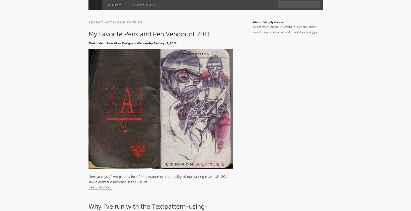
Friendlyskies redesign is now live
Update, April 9, 2012: Three months later and this is obsolete. I redesigned again. It’s kind of fun, you know.
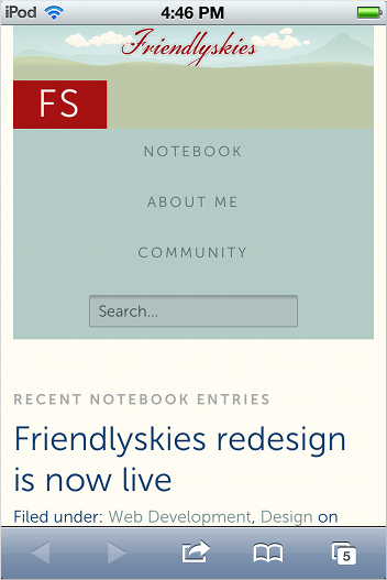
And hey, it’s friendly to small screens, too.
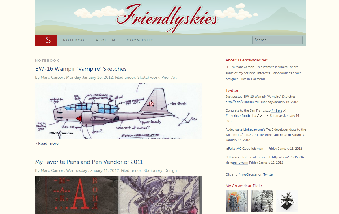
Just last night I launched the Friendlyskies.net redesign. It has taken a lot longer than I planned. More important things kept getting in the way. But it’s done now, and I’m here to share and document my thought process.
Design can make you more productive
First of all, the last version (below) was based on the Skeleton CSS framework. It was a good start at a responsive (in other words, iPhone, iPad, mobile-friendly, etc.) website. But the lack of color in the design really bored me.
I wanted the new design to convey my own values: Warmth, relationships, casual humor, bold strokes, and openness. I didn’t want to feel like I was posting blog entries to someone else’s website.
Colors can do most of that for you
To convey a feeling of warmth, you’ve got to warm up your colors. I knew a background color with some subtle warmth would be a good place to start. The idea was to convey a paper journal without getting too literal and adding little bits of paper pulp texture. Literal cues in design (even skeuomorphic design) are fine, but I’d like to be a bit more understated here.
Next I knew that warmth can easily kill a feeling of openness, to say nothing of “bold strokes,” which are definitely part of my personality. I would need some cool colors to offset the warmth and allow for a bold color to come in. Thus the cooler greens and blues.
Red was almost a given. This is the bold stroke. I wanted to cement the warmth and tie everything together. I set the “FS” assistant menu logotype in reverse-on-red and set the sidebar headers in the same red color.
Finally, the headers felt wonderful in a deep, saturated, blue color. Like a nice fountain pen writing in my nice journal. Again, not trying to be literal, so didn’t use a script font.
Random data loss helps every redesign
At this point I accidentally overwrote one of my CSS files. I immediately restored from an off-site backup, but you know what? I ended up removing the stuff I lost anyway, and redoing a lot of the spacing and sizing metrics from scratch. That’s a good reminder—sometimes it can be refreshing to “kill your darlings”—get rid of the things you love most in a design, and see if it can help the overall direction.
Let’s keep that font.
I have enjoyed using Museo Sans so far, so I kept it around. I feel like it’s technical (like me) but still pretty warm (like me) and intimate (like me when I’m sipping cocoa). I’m always on the lookout for different fonts though, and I have to admit it bugs me that Museo is thrown around a lot on other sites without much purpose.
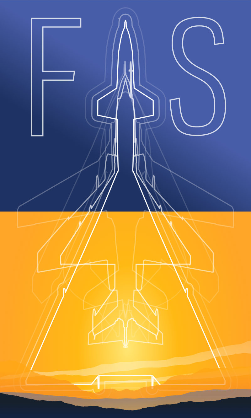
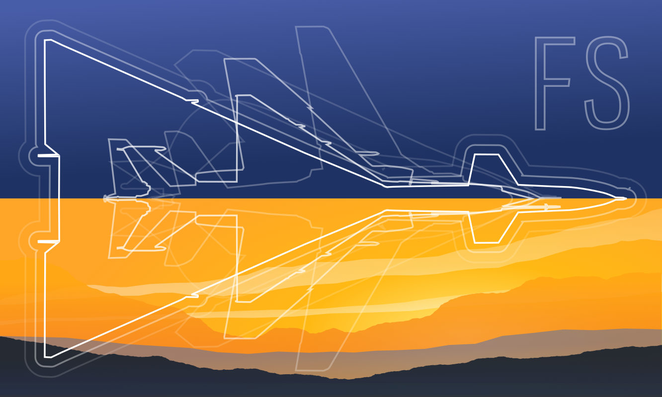
And a dash of illustration
There’s a risk of really going off the rails when you add illustration to a design. So far, my illustration work here is mostly decorative. And it’s a literal take on “friendly skies,” which I have avoided in the past, but I took it head-on this time. That will probably change with future illustrations. I’d like to try a few different ideas up there in the header.
The thing that pleases me most about the current illustration is that it’s very iconic. Though simple, to me it evokes a bit of early Showa style. In addition, the added “FS” in the icon below gives a bit of a hanko look, right?
Favorite Part: Apple Touch Icon
I’ve always loved designing little icons for websites. One of my most recent clients, the Ukiah Natural Foods Co-op, really love their new turnip icon (the tiny thing that appears in your browser tab or favorites list). With the Friendlyskies redesign, I enjoyed making Apple touch icons of different sizes. I think they look cool.
Also, this is a mobile-friendly site. Gotta do the touch icon then.
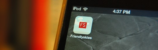
There we go. We’re mobile.
What do you think? I’m @Circular on Twitter.